LOGO DESIGN IS ONE OF those disciplines that inevitably polarises opinion (remember when Australia’s Commonwealth Bank unveiled its “Jatz cracker and Vegemite” logo a few years ago?) but the time inevitably comes when a company desires a new look.
Kia has made just such a decision, accompanied with the expected florid explanations and designer jargon.
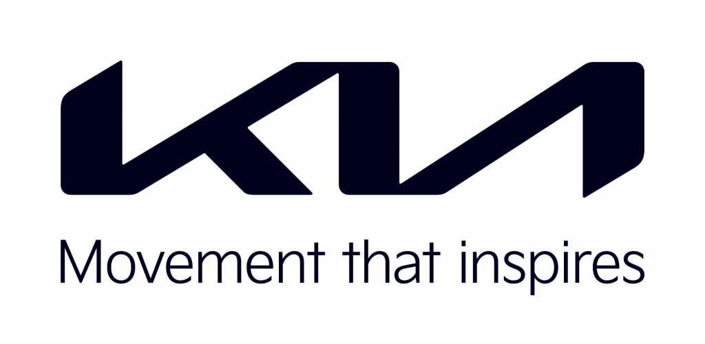
To quote: “Kia has revealed its new corporate logo and global brand slogan that signify the automaker’s bold transformation and all-new brand purpose. The introduction of the new logo represents Kia’s ambitions to establish a leadership position in the future mobility industry by revamping nearly all facets of its business.”
Well, that’s not actually too over-the-top, unlike the next few paragraphs: “The logo is a symbol of Kia’s new brand purpose and the values it promises to offer customers through future products and services, and the experiences these enable. Kia seals its brand promise by developing the new logo to resemble a handwritten signature. The rhythmical, unbroken line of the logo conveys Kia’s commitment to bringing moments of inspiration, while its symmetry demonstrates confidence. The rising gestures of the logo embody Kia’s rising ambitions for the brand, and, more importantly, what it offers customers.”
Hmm, “rising gestures”, “handwritten signature”, “rhythmical unbroken line (representing) moments of inspiration” …

“Kia’s new logo represents the company’s commitment to becoming an icon for change and innovation”, said Ho Sung Song, Kia’s President and CEO. “The automotive industry is experiencing a period of rapid transformation, and Kia is proactively shaping and adapting to these changes. Our new logo represents our desire to inspire customers as their mobility needs evolve, and for our employees to rise to the challenges we face in a fast-changing industry.”
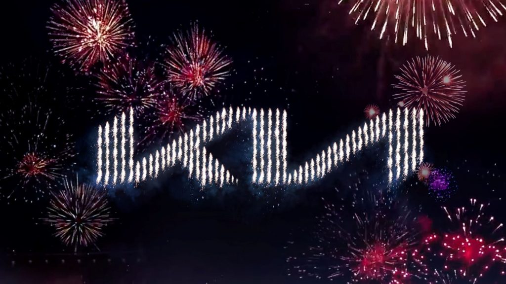
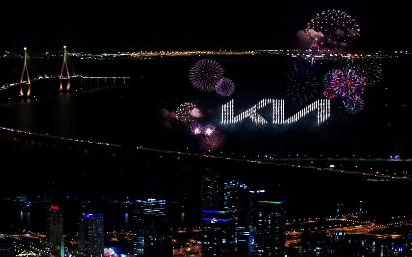
The new logo was unveiled during a record-breaking pyrotechnic display in the skies above Incheon, Korea. The event saw 303 pyrodrones launching hundreds of fireworks in a synchronised artistic display, igniting and celebrating Kia’s new beginning. This set a new Guinness World Record for ‘Most unmanned aerial vehicles (UAVs) launching fireworks simultaneously’. The dazzling display can be seen here
A new brand purpose and strategy to be revealed on January 15
In addition to an all-new logo, Kia revealed its new global brand slogan, ‘Movement that inspires’.
The launch of the new logo follows the announcement of Kia’s ‘Plan S’ long-term business strategy in 2020. Under Plan S, Kia, among other objectives, has the ambition to take a leading position in the global car market. This is focused on popularising electric vehicles and introducing a broad range of mobility services, tailored to meet the needs and tastes of individuals and local markets.

A second opinion
seniordriveraus spoke to one of Australia’s most respected graphic designers for an independent opinion.
He prefaced his comments with the proviso that he hadn’t seen the brief, so there could be factors of which he isn’t aware.
“I looked forward to seeing it,” he said. “And then I felt disappointed when I saw it. It doesn’t fit into the mould that I like when it comes to a badge. It is a fluidy, flat mess. It’s not particularly easy to read, which I think it should be as there is nothing else to provide a link to the product. I get no sense of meaning.”
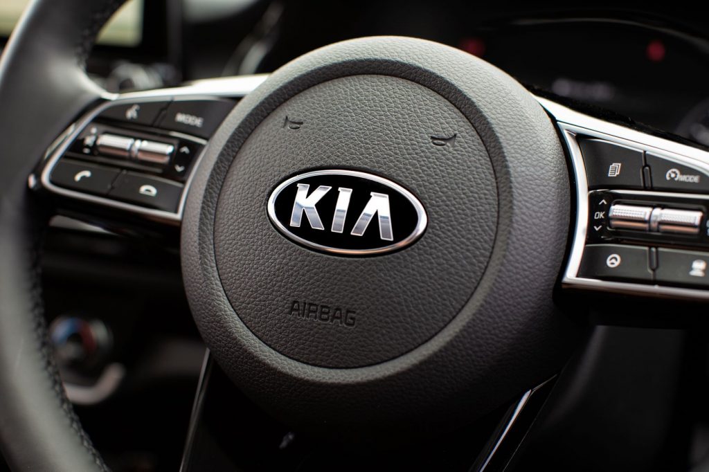
Like us, he wonders how it will look when applied to vehicles. “I’m always looking at the multiple applications it will have and how it will work across them all. Looking more modern and being executed more trendy does not make a good logo.”
Like us, he wondered about the lack of Korean culture, although we suspect this may have been deliberate. “I don’t know enough about Korean culture and design so I have no idea if it has any connection, or if the basis of the design concept, is Korean.”
We weren’t particular fans of the previous Kia logo. Time will tell if this new design fares any better.

